Easier night shifts — choose your own colour theme in Validi
27 April 2026

Light, dark and colour-blind-friendly themes in Validi make the journal system accessible for day and night shifts. See how personal display settings work.
Accessibility is not a luxury in a journal system for addiction treatment and social psychiatry — it is a prerequisite for error-free work on a long shift. When the night shift sits in front of the screen at two in the morning, the colours mustn't glare. When a colour-blind social worker reads a medication status, the information cannot rest on red and green alone.
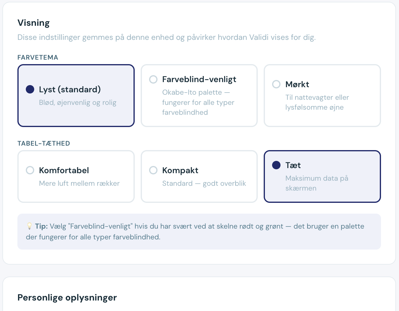
That is why Validi lets every staff member choose their own colour theme directly in their user profile. You can switch between a light default theme, a dark theme for shifts in dim lighting, and a colour-blind-friendly theme that works for all forms of colour blindness. The choice is saved per user — not per clinic — so colleagues can use different themes without affecting each other.
In Validi, buttons, tables, dashboard charts and even medication status automatically follow the chosen theme. That makes it possible to work comfortably around the clock and still read the most important information correctly — regardless of how the individual staff member perceives colour.
What is an accessible colour theme in a journal system?
An accessible colour theme is a visual setting that ensures all text, icons and statuses can be read correctly by users with different needs — for example impaired vision, colour blindness, or long-term screen work in poor lighting. In practice it comes down to contrast ratios, colour choices, and the combination of colour, icon and text.
In Denmark, public and municipal IT systems follow the international WCAG guidelines (Web Content Accessibility Guidelines), which require a minimum of 4.5:1 contrast between text and background. Validi meets WCAG 2.1 AA as a minimum across all three themes, so clinics under municipal contracts can document accessibility when it is required in tender documents.
Which three colour themes does Validi offer?
Each staff member can switch between three themes:
- Light theme: The default display with a white or light background and dark text. Suited to general daytime work and well-lit offices.
- Dark theme: Dark background with light text. Suited to night shifts, dim lighting, and staff whose eyes tire from long screen days.
- Colour-blind-friendly theme: Adjusted colours and clear icons so status is never communicated through green/red alone, but always through shape and text as well. Works for all forms of colour blindness (deuteranopia, protanopia and tritanopia).
The choice is a personal setting. Each staff member changes it in their own user profile without affecting colleagues.
How do the colour themes work in practice?
Imagine Mette, a nurse at a 24-hour staffed supported-housing facility. She works rotating shifts — day shift 7 am to 3 pm, evening 3 pm to 11 pm, and night 11 pm to 7 am.
On day shifts she uses the light theme because the room is well lit and sunlight floods in through the windows. When she comes in for the night shift at 11 pm, she logs in and switches to the dark theme in two clicks. The screen no longer glares at the residents who are still awake, and Mette can sit in front of the system through the night without straining her eyes.
Her colleague Kasper has red-green colour blindness. He uses the colour-blind-friendly theme all the time. When he reads the resident list, he still sees a clear difference between "✓ OK" (medication given), "! Late" (administration overdue), and "○ Next" (medication due soon) — because the status is shown with colour, icon and text at the same time.
Benefits of accessible colour themes in social psychiatry and addiction treatment
Social psychiatry services and addiction treatment centres are characterised by 24-hour staffing, rotating shifts and staff with very different needs. An accessible journal system delivers concrete benefits:
- Fewer errors at night: the dark theme reduces glare and headaches so the night shift can read medication charts correctly
- No staff are excluded: colour-blind employees can be hired and use the system without special adaptation
- Compliance with municipal requirements: WCAG 2.1 AA typically satisfies the accessibility requirements in Danish municipal IT tenders
- Better well-being on long shifts: 12-hour shifts in front of a screen are easier to manage with the right theme
- Personal customisation without IT involvement: staff change their own settings — without asking an administrator for help
That matters all the more in a sector where a missed detail in medication recording can have serious consequences for the service user. Clear visual information is patient safety.
What other accessibility features does Validi offer?
Colour theme is one element of a broader accessibility effort. In Validi, each staff member can also:
- Adjust table density: choose between comfortable, compact or dense table views. Concretely, you can see 10, 20 or 40 rows on the same screen — depending on whether you need an overview or the details.
- Read medication status with colour + icon + text: the old red dots have been replaced by pill-shaped buttons that show status three ways at once: green/red colour, icon (✓/!/○) and text ("OK"/"Late"/"Next"). That makes the status unambiguous — including for colour-blind users.
- Follow dashboard charts in the chosen theme: all bar charts, pie charts and number cards on the front page automatically change colours with the chosen theme, so contrast is always correct.
We have worked with Danish clinics in addiction treatment and social psychiatry since the rebrand to Validi in 2026, and the feedback from night shifts has been consistent: the dark theme is the difference between an OK shift and an exhausting one.
How do you keep track of accessibility digitally?
Accessibility is not just a setting — it is something that needs maintaining. In Validi, clinic administrators can see which themes their staff use, and any accessibility issues can be addressed proactively.
Audit history and tracking
All changes to user settings are logged automatically in Validi's audit trail. That means you can see when a staff member changed their theme, table density or other personal settings. During inspections or quality assurance work, you can document that the system is adapted to each staff member's needs.
Are personal settings GDPR-compliant?
Yes. Colour theme and display settings are stored against the staff member's user ID in Validi's database, which is encrypted and hosted in Europe. The settings are not shared with other clinics or third parties, and they do not form part of resident records.
Because the settings are not sensitive personal data under GDPR, they do not require separate consent — but they are logged in the audit trail on the same basis as all other user activity. That guarantees full traceability without compromising the individual employee's working environment.
How to choose your colour theme in Validi
Changing your theme takes less than 30 seconds:
- Log in to Validi.
- Click your name in the top right corner and choose Personal settings.
- Under Colours and appearance you'll see the three themes as live previews.
- Click the one you want — it activates immediately.
- Adjust table density (comfortable, compact or dense) under the same section if you wish.
The choice is saved automatically and follows you across devices, including when you log in from a different computer or mobile. Want to see all accessibility features in action? Read more about Validi's features for addiction treatment and social psychiatry or book a free demo of Validi.
Frequently asked questions about colour themes in a journal system
Can each staff member choose their own theme, or are themes a clinic-wide setting?
Each staff member chooses their own theme individually in their user profile. That means the day shift can use the light theme, the night shift the dark one, and the colour-blind colleague the colour-blind-friendly theme — at the same clinic, at the same time. The choice only affects that one staff member's display and is completely independent of colleagues and clinic-wide settings.
Does the colour-blind-friendly theme work for all kinds of colour blindness?
Yes. The theme is designed with colour palettes and icons that work for deuteranopia, protanopia and tritanopia — the three most common forms of colour blindness. Critical information like medication status is never communicated through colour alone, always as a combination of colour, icon and text. That makes the status unambiguous regardless of the user's colour vision.
Do dashboard charts and tables also change theme?
Yes. The whole of Validi changes theme at once — buttons, tables, forms, dashboard charts, pie charts, bar charts and medication cards. You don't have to set it in multiple places, and you won't see a "flash" between light and dark as you move around the system.
Does Validi meet WCAG accessibility requirements?
Yes. All three themes in Validi meet WCAG 2.1 AA as a minimum. That means at least 4.5:1 contrast between text and background for body text, and 3:1 for larger text and graphical elements. That is the same level typically required in Danish municipal IT tenders and on public-sector websites.
Can I change table density independently of colour theme?
Yes. Colour theme and table density are two separate settings. You can use the light theme with dense tables or the dark theme with the comfortable view — whatever suits you. Both settings are saved to your user account and follow you when you log in from other devices.
Do I need to log out to change my theme?
No. The theme changes immediately when you choose it in your personal settings — you don't have to log out or reload the page. The whole interface updates colours, contrast and icons instantly, and your choice is saved automatically to your profile.
What about new staff members — which theme do they get by default?
New users start with the light theme as the default. They can switch freely to the dark or colour-blind-friendly theme at any time in their personal settings. Clinic administrators cannot force a particular theme on staff — it is always a personal customisation.
Was this post helpful?